
Responsive Layout Basic Setup
Resp 2 Column Stack

Resp 3 Column Stack

Resp 4 Column Stack

Resp 5 Column Stack
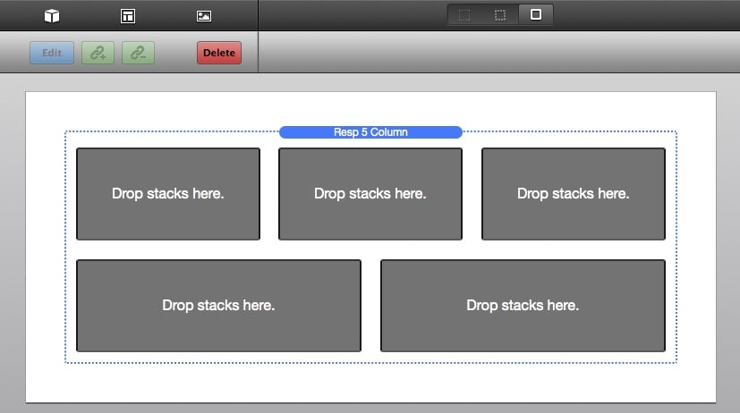
- When you drag a Responsive Column Stack out, you will see one of the above stacks appear on your page.
- Drop in the content you want to make responsive. Remember, the column stacks will not make non-responsive content responsive (like images), it only makes the columns responsive.
- The stack settings are minimal, until you click on the Advance Settings. Once you check that box, you get settings so you can adjust the column widths, adjust the column gutter, and also determine when you want the columns to break.
- Now preview and enjoy! For an summary of the remaining settings please refer to the Responsive Column Settings section.
Deal of the Week
Latest Updates
Latest Live Stream

Hangout Time! Live Q&A and maybe some live coding

{{ title }}
Latest Design

© 2025 Weavers Space | Terms of Service | Privacy Policy
